
The Von Restorff Effect
Von Restorff. A household name. I remember growing up sharing stories about good old Von Restorff. Me and my friends all celebrate Von Restorff day. Good old Von Restorff #VonRestorff4PrimeMinister. For those of you who have been living under a rock and have never heard of this absolute legend and his amazing effect, it is the idea of inconsistency; that which stands out, will be remembered. That’s why if I told you that last night for dinner I ate fish, potatoes and nightmares, you’d be more likely to wonder why the hell I had a nightmare for dinner (everyone knows nightmares go better as a light lunch with a medium glass of Sauvignon Blanc). But how do we apply this to our design work? Well crack open a fresh tin of nightmares and pour a glass of Casillero del Diablo, you’re about to find out.
Be a bit smart
Consider if you will, the below image:

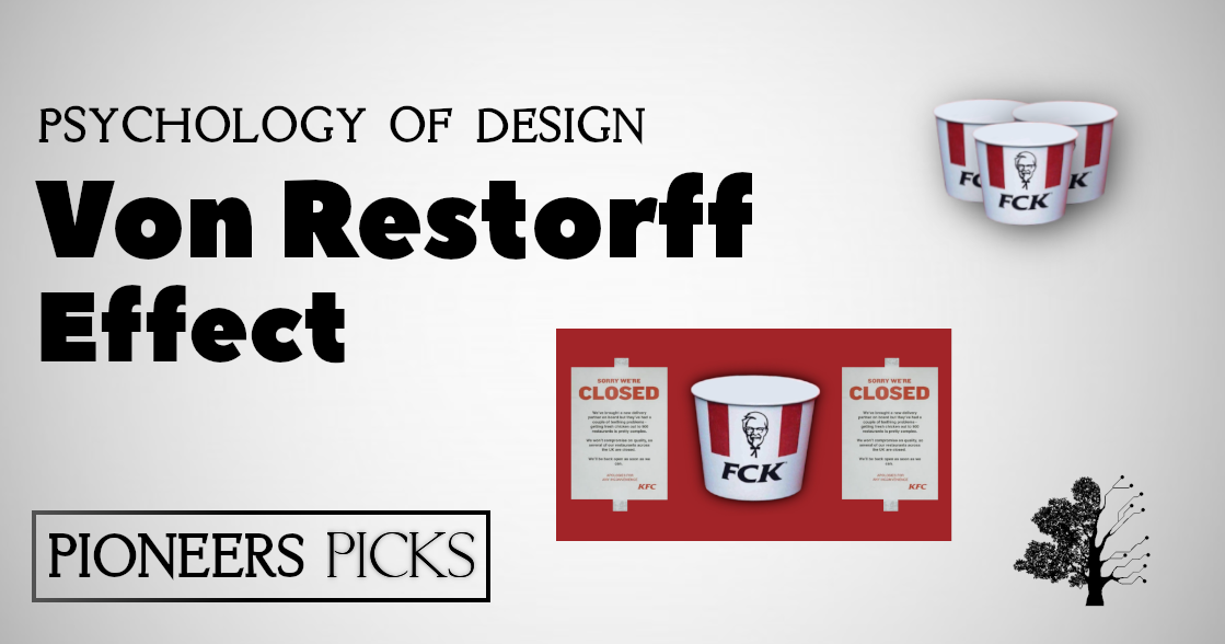
Tiny font, similar colours, hard to spot company name. That is boring. I’m bored. That’s not going to butter many parsnips. You need instead to give distinction to the key information in your content. You can see they’ve sort of tried to do that, by making the Oxfam name white, but really that’s not enough. A better example is shown below in an post by KFC to apologies for their lack of chicken:

In a clever twist, KFC spelled their name backwards and made people think they were swearing. It stands out, and it’s a little bit naughty. As well as that the ‘FCK’ is written in black, standing out against the white and reds that surround it. Good work KFC.
Consider colour
As seen above, colour makes all the difference. If you have a light background with a light text, it’s going to be harder to make out than something bold that draws the eye. In your design work, you’re going to be attempting to appeal to people who are going to swipe, glance and go. You want to make the most of that! The colours that you use make all the difference there. Here is a useful article about colours that work well together!
Keep moving!
Movement gains a lot of attention. Creating video content is a really good way to get people to notice you. Combining strong colours and distinctive wording with this content works well. In addition to that, sites like Instagram and Facebook are really trying to push video content in order to present valid competition with YouTube, so video content in that respect would be beneficial for you too. Be aware of utilising this in UI design however, as video content can be annoying and distracting for some users.
Frame the choice you want
While we’re on the topic of User Interface, take a look at the below price plan:

The designer has decided that they want to draw their user’s attention to that specific option and as a result, have highlighted it for them with the caption “most popular” – whether or not this is true is unknown, but when it comes to the networks of association that people build up – the one that is highlighted is the one that shall be looked at first. As this is the first price observed, future prices will be compared back to it.
Don’t overdo it
Whilst the Von Restorff effect is tremendously useful for graphic and UI design, there is no need to go overboard with it. Adding one or two elements to highlight your content is good, however trying to combine them all together can result in a really annoying, awkward mess that encourages people to stay away. Like me.
So that’s it really. The Von Restorff effect is useful in small doses and can serve your design work really well. Go forth and create something beautiful now, and don’t run out of chicken.
