
“The whole is other than the sum of the parts.”
Kurt Koffka
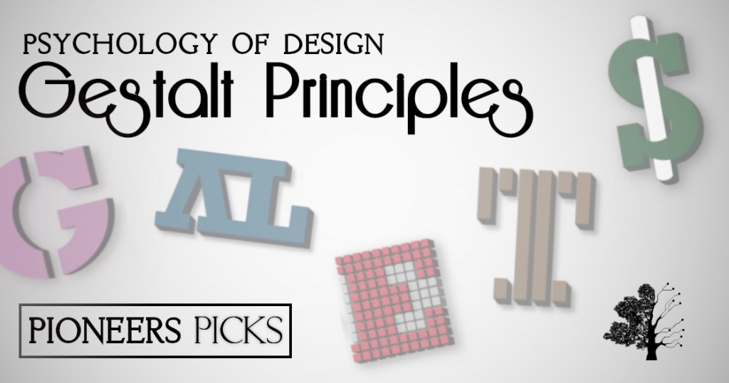
The Gestalt Principles. We all know of them don’t we? We’re always seeing them mentioned everywhere, aren’t we? It seems we can’t go one day without hearing something about the Gestalt Principles and what they’ve been up to. If you’ve somehow never heard of these world-famous principles – you’re in for a treat. Gestalt, first and foremost is a psychological term that describes an organised whole being greater than the sum of its parts. So strap in, it’s going to be a crazy one.
Figure/ground
The principle of figure and ground relates to the fact that the eye will identify objects based around what they perceive to be the foreground vs the background. A great example is shown below – the vases are clearly apparent in the foreground, leaving a silhouette of some humans in the background. Or is it the other way round? You can use this effect in your graphic design work, playing around with different objects of focus!

Similarity
The next principle is that of similarity. When looking at absolutely anything, it’s natural for human beings to group similar things together. For example, in real terms, we associate Fish & Chips with the beach – yum yum! But if we think of going to the theatre, Fish & Chips isn’t something that immediately pops into our mind. This is called Schema theory and it sort of applies here. We won’t go too much in depth about it right now, but it’s certainly relevant to the Gestalt Principles. If you’re interested, here is another blog we’ve written on the matter.
In terms of design, this similarity can manifest itself visually, with similar colours grouped together in your audience’s mind, similar sizes, similar shapes and whatnot. These groupings are really useful, as they will attract the viewer to the object, because they notice these similarities, whether consciously or not.
Proximity
Put simply, objects that are grouped closer together, are perceived to have more relevance to one another than that which is further away. There is a psychological ‘closeness’ between the two items and as a result, your viewers will gravitate towards those items that seem closer to one another. An example of this is show below – the objects on the left are perceived to be together, whilst the objects on the right are perceived as being separate groups.

Symmetry
This idea of symmetry pertains to the two examples provided above in that it creates a sense of similarity regardless of proximity. These objects aren’t grouped together and yet they are associated. It could be argued that this comes under similarity, however, it does differ slightly, in that, similarity identifies two objects as, well, similar, whereas symmetry identifies two objects as being the exact same. This can be really useful in the conveyance of information between you and your audience. If the layout of your design is symmetrical, less time is taken up in your readers mind identifying how to read the layout, they just read it! Very useful! Hooray!
Closure
Closure is where a bit in your noggin creates a whole image despite missing information. Provided there is enough information provided in the image that is visible, the brain is capable of understanding this image as a whole – proving the entire idea of Gestalt, that the whole is greater than the sum of its parts! A cracking example of this can be found in the WWF logo – for the most part, it’s completely blank, but you know what it’s meant to be!

And on the subject of closure, our sermon comes to an end. We hope you had a great time reading this blog and if not, please send your concerns to complaints@facebook.com. Now be about your business!
