
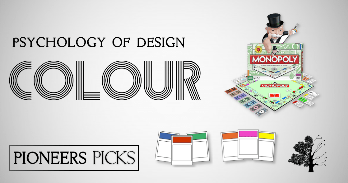

Does the monopoly man have a monocle?
Yeah, course he does.
Except he doesn’t.
What are you talking about, of course he does!
He doesn’t! Look!

Well you’re an incredibly talented marketing company, you’ve just photoshopped it out!
Alright, look: https://www.google.com/search?q=monopoly+man&tbm=isch
Wow. Why did I think he had a monocle then?
I’m glad you asked, imaginary voice. It’s called a Schema: neural frameworks that speed up how we think. We create networks of associations in our minds that cause us to associate one thing with another. In this instance, the associations our brain makes with the monopoly man is likely: money, rich, top hat, tails, cane, posh, bow tie. In our heads, we slip “monocle” in there too, because we associate with the other things and it speeds up the process. Weird, right?
It’s not just a fun mental trick though, there are some very real applications for mental schema, that can be incredibly useful for you to consider. From colour to consistency, this series of blogs examines the psychology of why some things look good and why certain things look simply awful, breaking it down in an applicable way for you and your business! Today, we’re talking about colour.
Colour is a shortcut to our feelings. We all think of red when we think of anger, we all think of green when we think of the environment and we all think of black when we think of having our eyes shut. But how significant can these colours be for your brand? Well, according to Oberlo (and a heap of other clever people) incredibly important. Let’s dive in,
Red
Attention! Achtung! Oi mate! The colour red alerts us and captures our attention. And with that, our brain thinks of excitement, danger, action and energy. Red can also encourage feelings of hunger (possibly due to red being associated with heat, and heat with food), hence why it’s used in the branding of almost every fast food chain.
The element of danger is something that can cause a sense of worry or dread, so if your brand colours aren’t necessarily red, perhaps it is worth considering its use for something such as a sales button, or a discount button. The means in which you utilise the schema of red is up to you…
Pink
The primary schema surrounding pink is femininity, womenkind, playfulness and love. Girls toys, women’s clothes, lingerie. It can also be associated with immaturity and childishness. This is why women’s clobber is largely marketed with pink labels, why cleaning products tend to be pink and why they use it in prisons too: pink, at least temporarily, encourages people to calm down and have pacifying effects.
Yellow
Clap along if you feel like a room without a roof! Yellow makes people feel joyful, happy, optimistic and gets ‘em thinking of summer. Quite simply, it helps people associate your brand with something positive. This is why brands like will use yellow, to create an image of positivity and happiness. You can imagine the scene: you’re in the passenger seat of a Lamborghini, Snapchatting the summer with a bottle of Lipton Iced tea in your hands, on your way to McDonald’s. What more could you want?
Blue
Calm down, be stable, live in harmony. This is the power of blue. It makes you think “everything will be aaaaalright.” This is one of the reasons that social media companies lean towards blue, it encourages trust and it encourages you to chill out, dude. On another point, blue can encourage feelings of coldness and chilliness. Hence why a great deal of water companies will incorporate blue. Have a nice, cold refreshing bottle of water, dude. Calm down.
White
The schema surrounding white is another obvious one. Cleanliness, purity and transparency. Black on white proves the most readable (hence they do it with them books we all read) and conveys efficiency and intelligence too. That’s why the BBC uses it and the WWF and Pioneer Creative Marketing use it. These companies are all brilliant and the designers behind them are all brilliant too.
Green
Money doesn’t grow on trees. But they’re both green. And that’s kind of relevant. Green is associated with money, nature, health and fertility. Products that are or want to appear as healthy and natural will utilise green to push that idea. Hence Whole Foods, Tropicana, John Deere use it. And Subway does too. And Starbucks. And Sprite. If you wish to convey ethical behaviour and if you want to pretend you’re ethical, go green!
The psychology of colour is a fascinating one, and something brands should treat with all due seriousness – when you’re creating your branding and your brand colours, think about what those colours represent and if that is in line with your message and ideologies. Then remember to keep it consistent. It’s very important. And next Tuesday, you’ll find out why.
